Thu Jun 16 14:40:02 PDT 2011
guerrilla web design
So I started up Firefox today, and was greeted by the NoScript upgrade page.
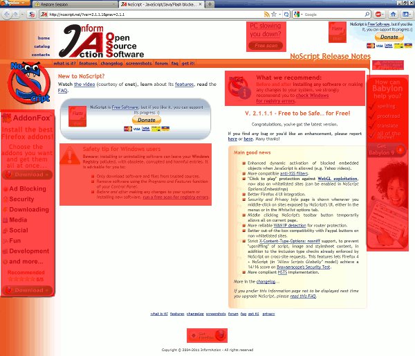
Typically I just close the tab, but I was waiting for some other programs to start up, so I actually read the changelog. Some interesting new features... Then I looked at the page itself. Man is it ugly:
I count two donation buttons, and six different ads... three of them in the same font as the rest of the page! I kinda regarded NoScript to be in the same company as AdBlock+, a pro-consumer extension, but this is a little too evil.
I don't often look at the source of advertising-encrusted pages, so this was a bit of a jaunt into the unknown. NoScript embeds the ads inside several layers of divs, possibly to foil adblockers.

Personally, I think asking for donations on a page filled with ads is kinda lame. So let's strip them out. First we save the HTML file to disk, which weighs in at a whopping 97 kilobytes. Doing this breaks the gradient on the left side, for some reason. Never mind that, we must soldier on. Removing the ads is easy enough, since they come prepackaged in comments like: <!-- START QSVQ7 -->. Amusingly, they contain Data URIs, which must account for some of the massive size of this page. Near the Flattr button, (Flattr is a micropayments scheme crossed with a pyramid scam) there's an empty element named "easylist_sux", a not so subtle zing on AdBlock+.
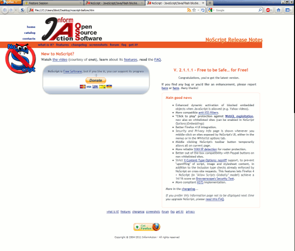
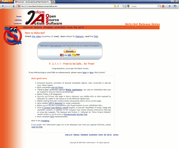
Turns out, those data URIs are big, because now we're down to 9.75kb. Now I move the changenotes into the left column, and delete some divs. Looking into the CSS, I find the missing background image, which isn't in the files folder. Apparently when you tell Firefox to save a page, it doesn't bother parsing the CSS file for links, which is just absolutely hilarious. Pretty funny, Firefox! You a funny guy! Then I tore out all the javascript, (except the paypal code) and hard-coded the main content column to 600 pixels.
You can find the final result here, a mere 7.10kb.


